 Tim Jones, here. From my blog, Old World Swine;
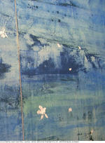
The painting at left, by Italian artist Angelo Casciello is an illustration that is part of the new lectionary approved by the Italian bishops. Sandro Magister comments;
The Italian bishops’ conference has entrusted the illustration of the
new Lectionary to thirty contemporary artists, with their styles. It’s
the first time that a liturgical book has been associated with modern
images. An audacious undertaking – and one immediately criticized
I have tried to find a clearer version of this piece of art online, but
so far have been unsuccessful. I would like to see it better so that I
can do a more fair critique. I realize there might be objections to
critiqueing the piece in this format, but right now it is all I have to
go on.
I also Googled up the websites of the other artists named in the
Magister article, and they all seem to be pretty well within the same
broad stylistic milieu.
Where to begin?
Let me just say what this painting is not; It isn’t beautiful, it
isn’t technically accomplished, well composed or evocative.
It probes none of the human experience of the event it depicts (the healing of the man born blind), and it
utterly fails to draw the viewer in or make them care about seeing it
again.
It is not really a work of art. Like so many modern abstract pieces, it
is a placeholder representing the idea of a work of art. There should
be a little rectangle in the middle with the words "place artwork
here". What this painting is, is easy. The shame of it is, there are
probably many living artists in Italy who could have provided, even in a very simple format, art of beauty and depth.
Now, of course, there will be those who will counter that they like
this piece and find it terrific in all kinds of ways, but I can only
respond in advance that lots of people liked disco, too. I would like
to hear explained why and how this is a good painting. To fall back on
"beauty is in the eye of the beholder" is a cop-out. There is certainly
a subjective element to beauty, but that is not nearly the end of it.
Some things are really beautiful and some things are really ugly, to
the point of making mere opinion superfluous. This is why people drive
as fast as they can through Nebraska to get to Yellowstone Park, and
not the other way around. Sorry, Nebraska. I give thanks for you every
time I open a bag of tortilla chips, but there is just not much to look
at there.
According to Catholic News Service, there are a number of translation
and typographical errors in this new Italian lectionary… so many that
they are issuing a set of corrective adhesive stickers to cover them
all. One wonders if they could not issue a new set of illustrations
in the same way.


